Consistency turns ideas into something people recognize and trust.
What was delivered:
Brand strategy
Brand identity
Typography
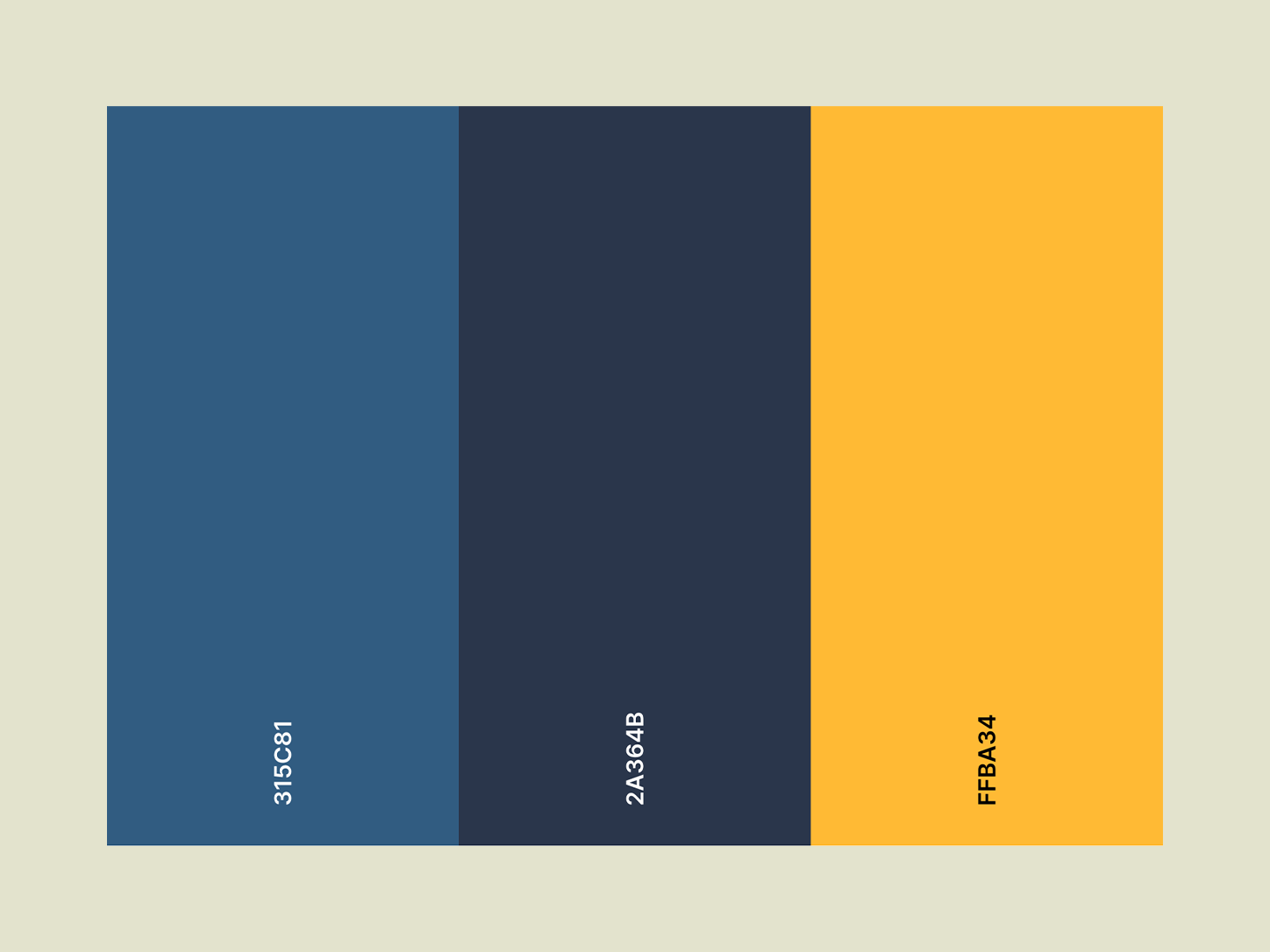
Color systems
Brand strategy
Brand identity
Typography
Color systems
The organization had grown over time, but its identity had not kept pace. Messaging, visuals, and direction had become fragmented, making it difficult to communicate clearly or consistently.
I recognized the need for alignment. Not just a new look, but a system that could bring clarity to how the organization presents itself at every level.
This project was developed as part of my role leading brand strategy and creative direction.
As the Creative Lead and Designer, I guided the development of the identity system, defined visual standards, and ensured the brand was implemented consistently across all platforms.
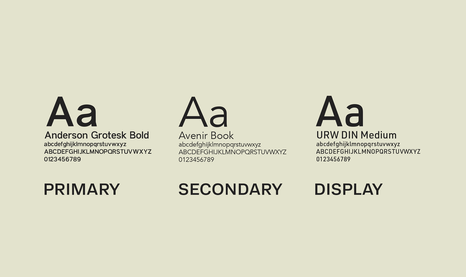
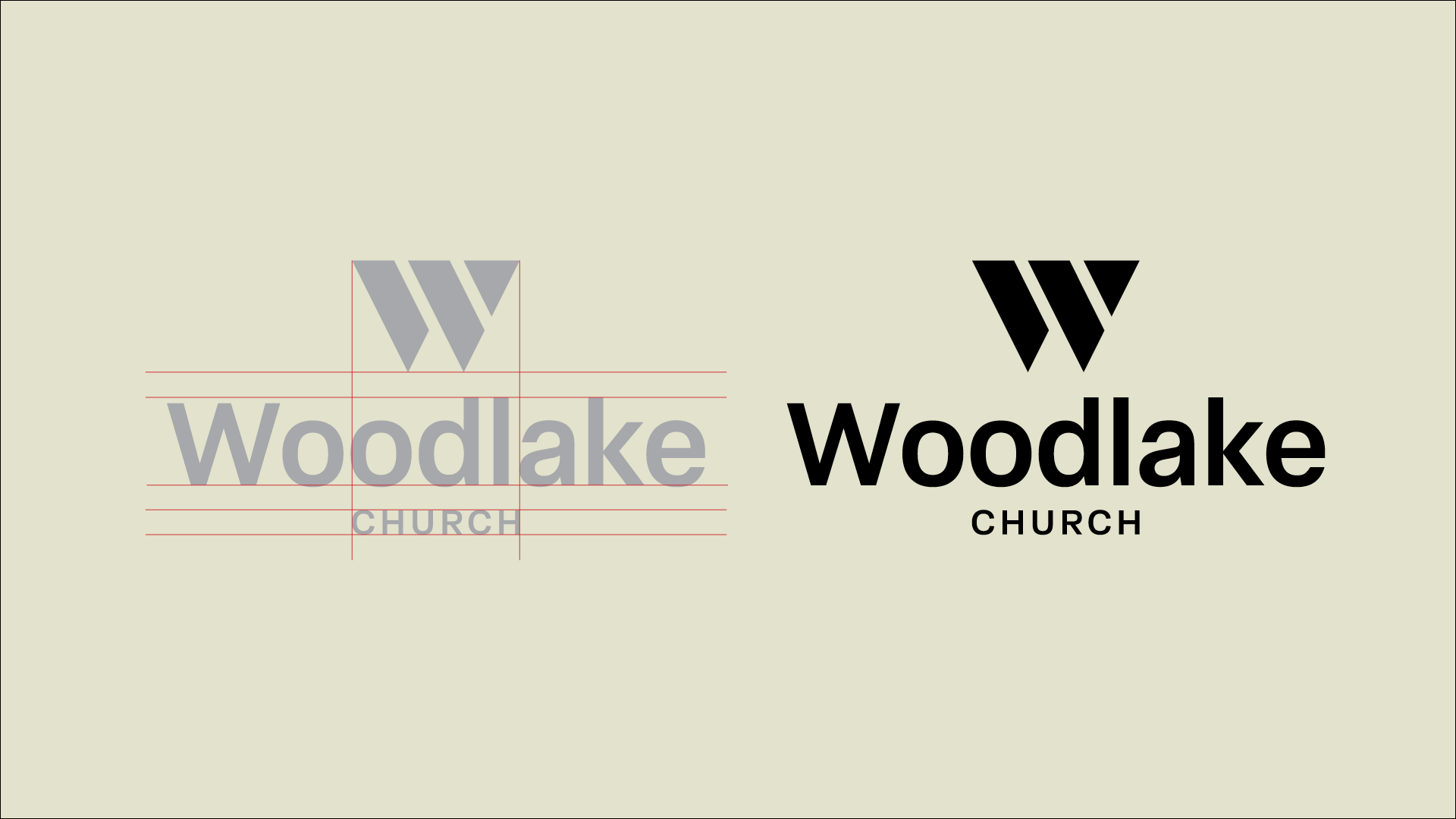
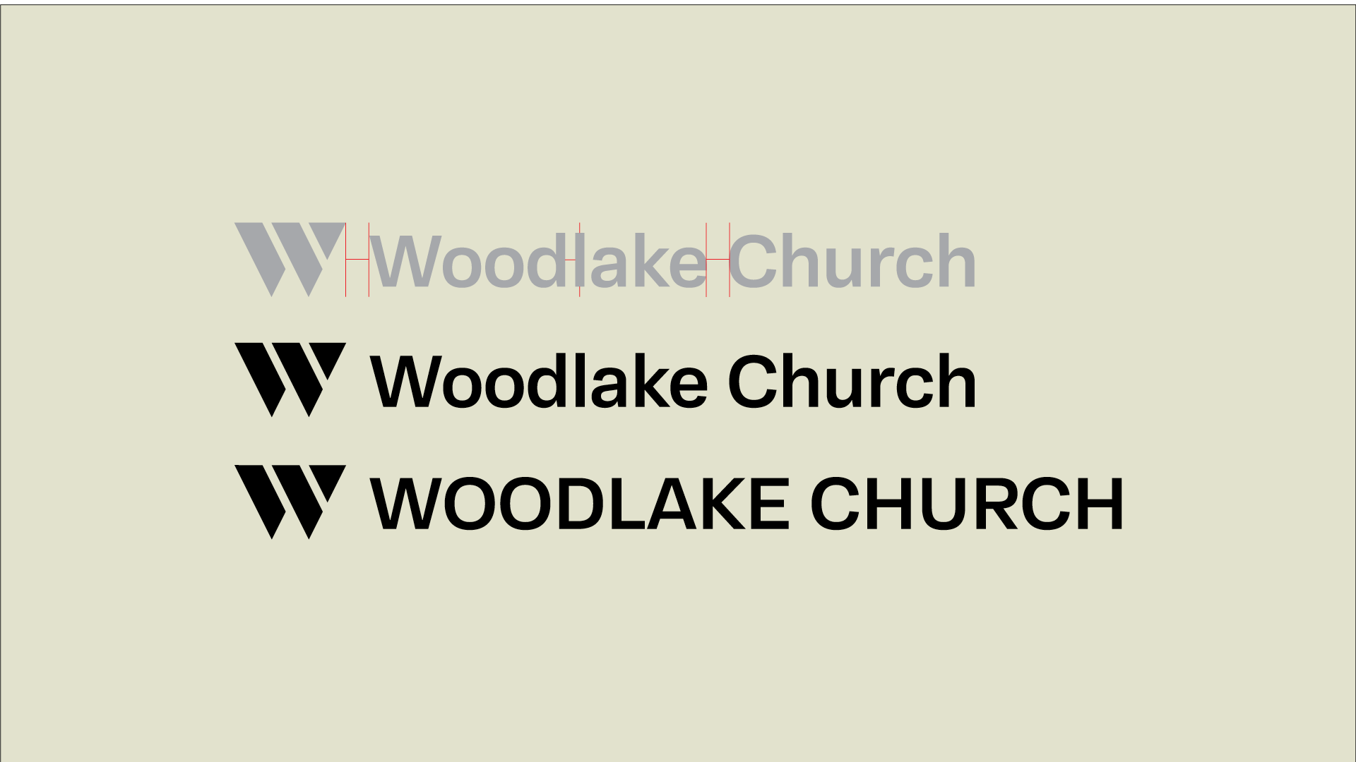
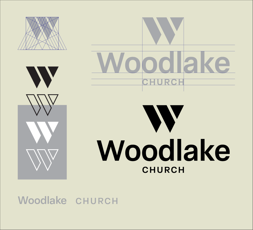
The rebrand focused on simplicity and cohesion. A refined visual identity, clear typography, and structured design system created a foundation that could scale across print, digital, and physical environments.
Typography, color, and supporting elements were defined to create a cohesive and scalable visual language.
Every decision was made to support consistency—so that no matter where someone encountered the brand, it felt unified and intentional.